NBA in VR
A 4 week experimental UX project, designing in VR for a live sports watching experience.
Role
User Experience
User Interface
Research
User Testing
Team
Armina Foroughi
Naheel Jawaid
Gary Li
Team
Sketch, Unity, Google Daydream and Cardboard VR headsets, Google Pixel
NBA in VR is an experimental user experience project that dives into creating a holistic watching experience for live basketball games in VR. We wanted to explore VR interface and experience design, and challenged ourselves in designing, iterating, developing and testing in this emerging technology. Unlike web and mobile based UI patterns, VR patterns are still undergoing a lot of exploration and experimentation.
In the end, we designed and prototyped a VR product using Google Daydream. Our product allows the NBA an opportunity to provide new digital viewing experiences in an engaging way. By leveraging the affordances in VR, we have the chance to give our viewers a more engaging, active role while they watch. NBA in VR lets you watch with friends, save and rewatch your favourite moments, switch seats, and keep tabs on other games, in comparison to the current product, NBA x NextVR, which currently only offers 360 live streaming.
Check out this Vision video we created for our project
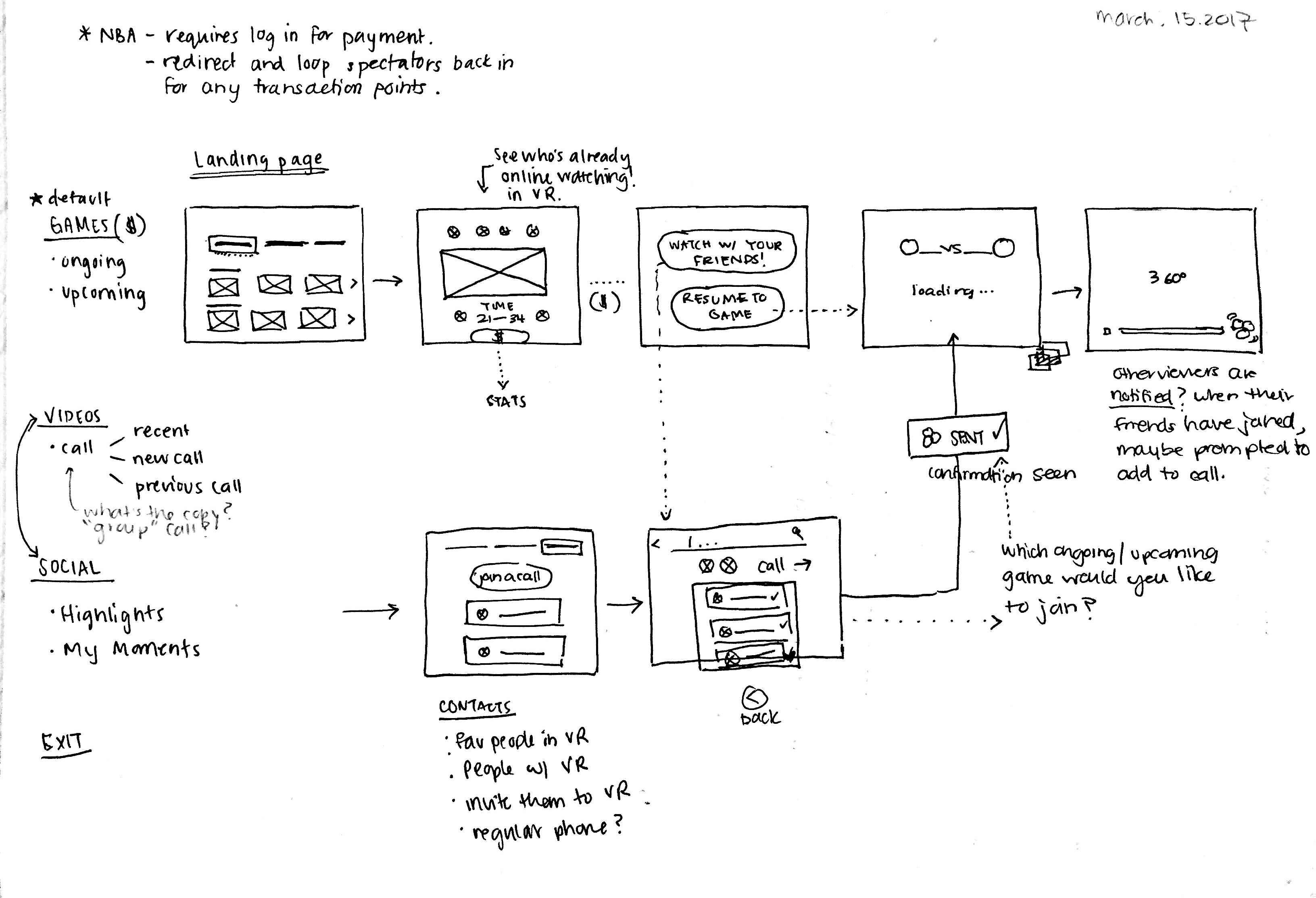
Pre-game Onboarding
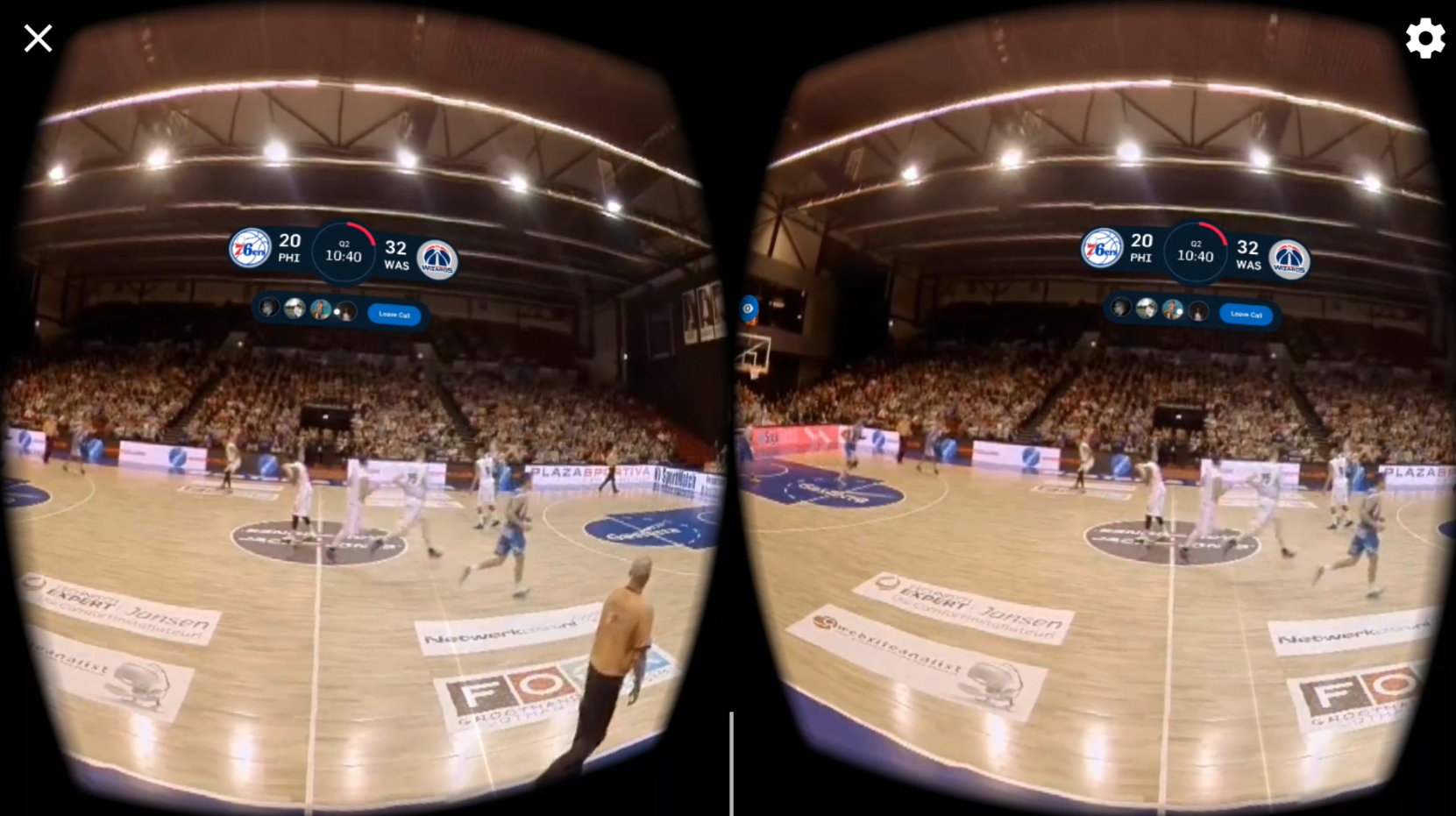
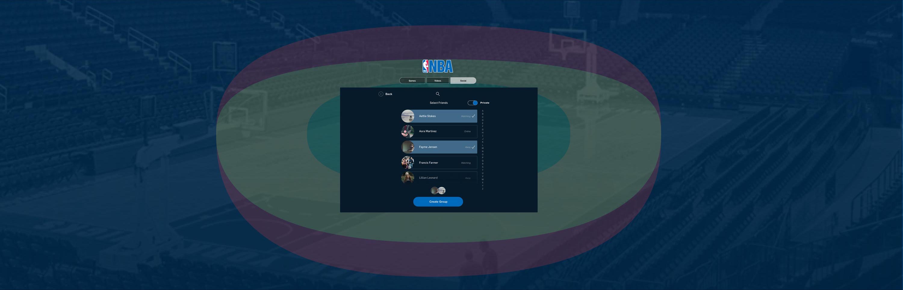
Upon entering, the viewer may see three primary tabs: Games(default), Videos and Social. To start watching from landing, viewers can browse ongoing/upcoming matches, with indicators of which friends are watching. Viewers can also start watching a game through the Social tab, which shows active friend, and public groups to join.
Friend groups act like conference calls, and Public groups allow communities to create a broadcast with a host where audience listens in and interacts through “reactions”. Networks and advertisers can also use this channel as an opportunity to provide their own branded NBA experience. The app affords a more socially engaging VR experience through offering a variety of viewing experiences, whether that’s watching individually, with friends, or with a community.
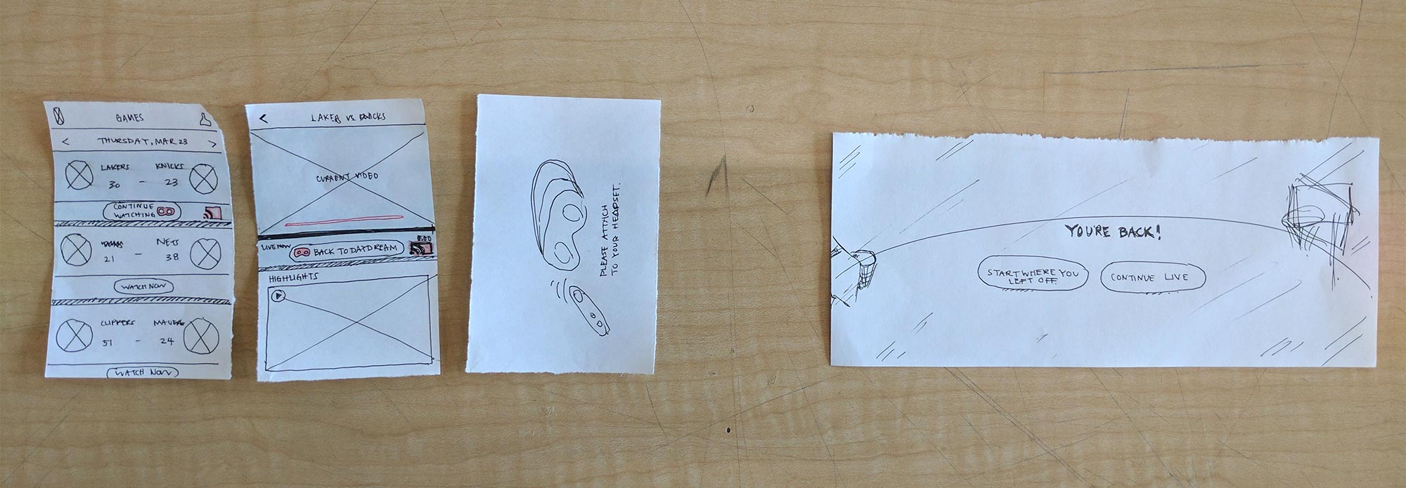
Playbar and Favouriting Highlights
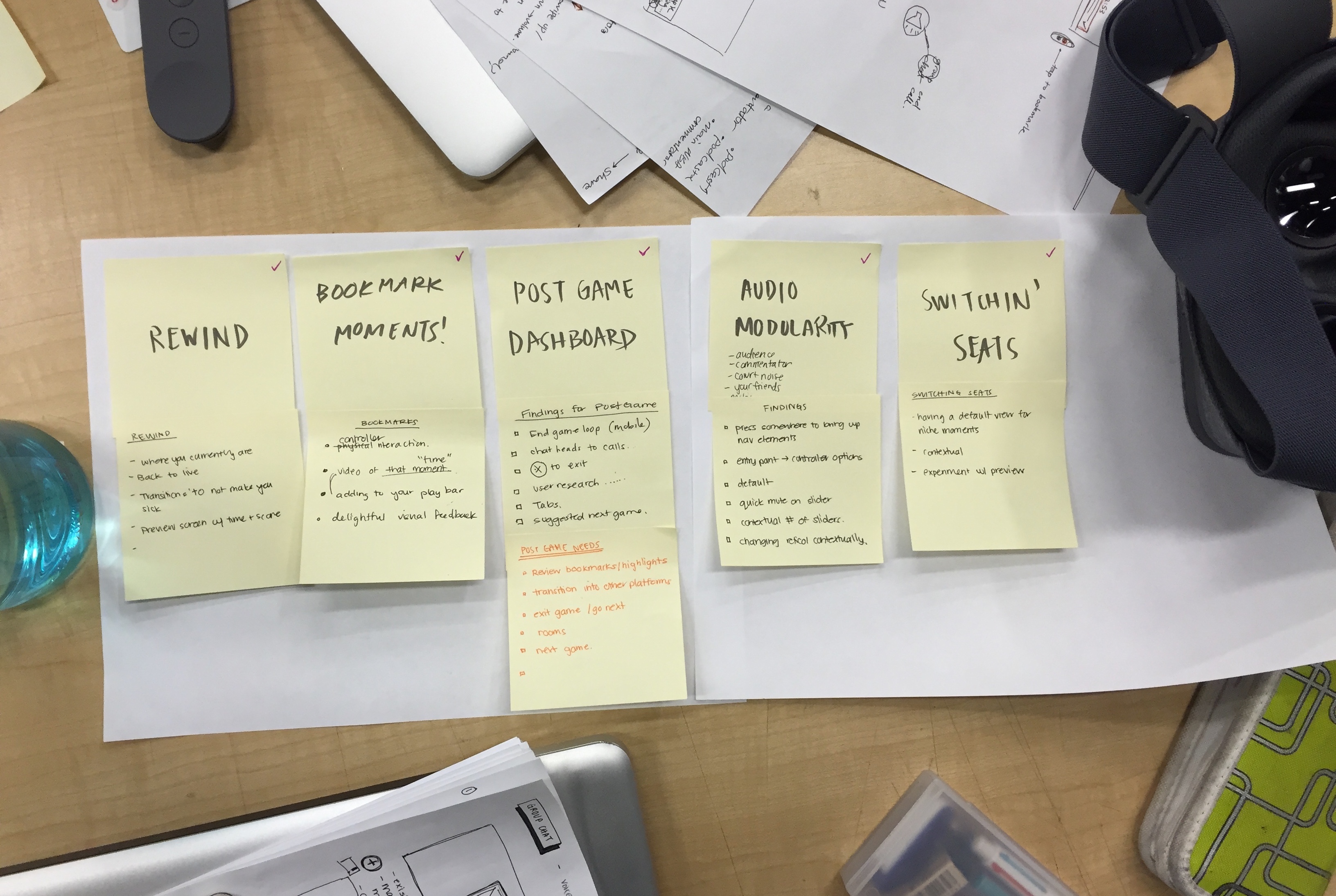
In the playbar, we implemented a highlights feature, where viewers can save and rewatch a key play in the game. Tapping anywhere once will bring up the player, while double-tapping (or hitting the favourite button) will save a key play you watched moments before. Saved highlights are accessible through the marked playbar, or click the dashboard icon to pull the whole reel up. At the end of the game, the Post-Game Dashboard lets viewers revisit their own, as well as other viewer-generated saved moments.
Switching Seats
Good seats at a game can influence the whole experience. With VR, we wanted to let viewers sit where they want, when they want. Swift dunk? Switch to the ‘net cam’. Tapping on the spectator-icons placed in the environment lets viewers switch seats quickly to follow the action. An insight discovered through user testing was that switching views is more common for niche moments, so we implemented a “main view” action button at the top to quickly get back to the spectator's default view.
Audio Modularity
Some viewers were interested in all aspects of audio in the game, while others not so much. In response to that, to make the viewer’s experience more customizable, our product lets them quickly customize what they want to hear. Once viewers press the volume button on the controller, they can continue into the audio panel for full control of various audio types: group call, commentator, crowd/ambient noise, and music. Quick toggles let them mute or switch between their presets so they can spend more time watching the match.
Browsing other games
Viewers can navigate to and track other games by using the app button, letting them quickly access and glance at other ongoing games. While they’re watching they can swipe through the cards, and hop into another game simply by holding the app button. This feature was implemented during an experimental sprint on possible controller interactions, where there were other ideas like reaction wheels, quick camera switching, and other gesture based controls.
Taking Breaks
Taking a break is inevitable when you watch a basketball game, especially since they run for three hours. Keeping the headset on for extended periods of time is one of many challenges that VR technologies face. We wanted to make sure our product was there for those transition points where viewers won’t want to miss that moment. Once viewers take off the headset they will be guided to the live-stream game on the mobile app, so that they can seamlessly continue to watch and track the game. When viewers are ready to immerse themselves again, a prominent CTA will take them right back into the VR experience.
End-game Dashboard
Once the game is over, the Post-Game dashboard will launch; viewers can take it easy and engage with a number of other options inside VR. For example viewers can stay inside the stadium space, wrap up any social group calls, relive saved highlights or best moments by NBA’s top-pick’s, or check out upcoming games.
Our Process
Learning to design for an emerging technology.
Getting Familiar with VR through Audits
Because our team had no experience in designing for VR, we needed to familiarize ourselves with this rapidly growing technology. We started with comprehensive research to understand best practices/workflows for designing in this medium—because we found only a few established design patterns and resources, it was a challenge wrapping our heads around how we can effectively do work. From our findings we created our own UX of VR handbook as an underlying basis to reference from before beginning our designs for Daydream.
Next, we dived into auditing VR experiences, taking a look at sources like UXofVR, online videos on Daydream, and existing apps for e-commerce and entertainment. It was important for us to interact and critique varieties of apps in order to learn what was working and what wasn’t. During this process we found design opportunities, experienced new VR-specific interactions, and noted challenges we might anticipate in our process down the road. By exploring VR, we uncovered problem areas like spacial disorientation, and opportunities in experimenting with motion, sound design, and skeuomorphism—these findings would later inform our process and final product.
Basketball Culture and User Research
After deep diving into research and familiarizing ourselves with VR technology, we diverged from auditing and spent time observing; asking questions about basketball fan’s needs and wants for our product. We looked further into the sports watching, and scoped out what the NBA currently offers. From there we interviewed seven basketball fans about how they watch games using a questionnaire we created. The insights lead to features we implemented, like favouriting and saving highlights from the game, audio modularity, as well as other features we took off the table in the end.
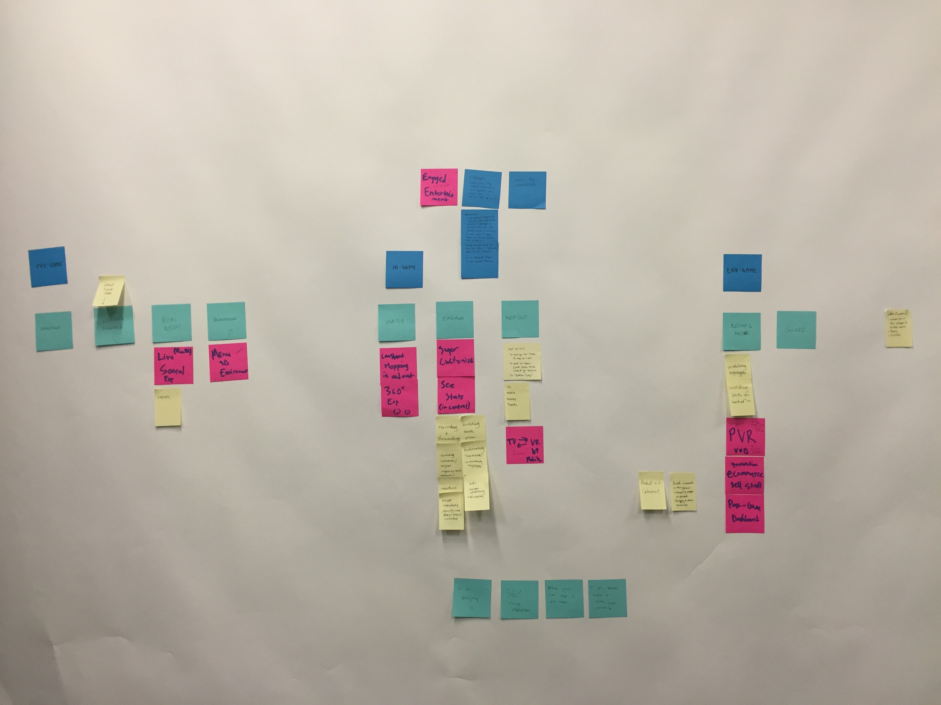
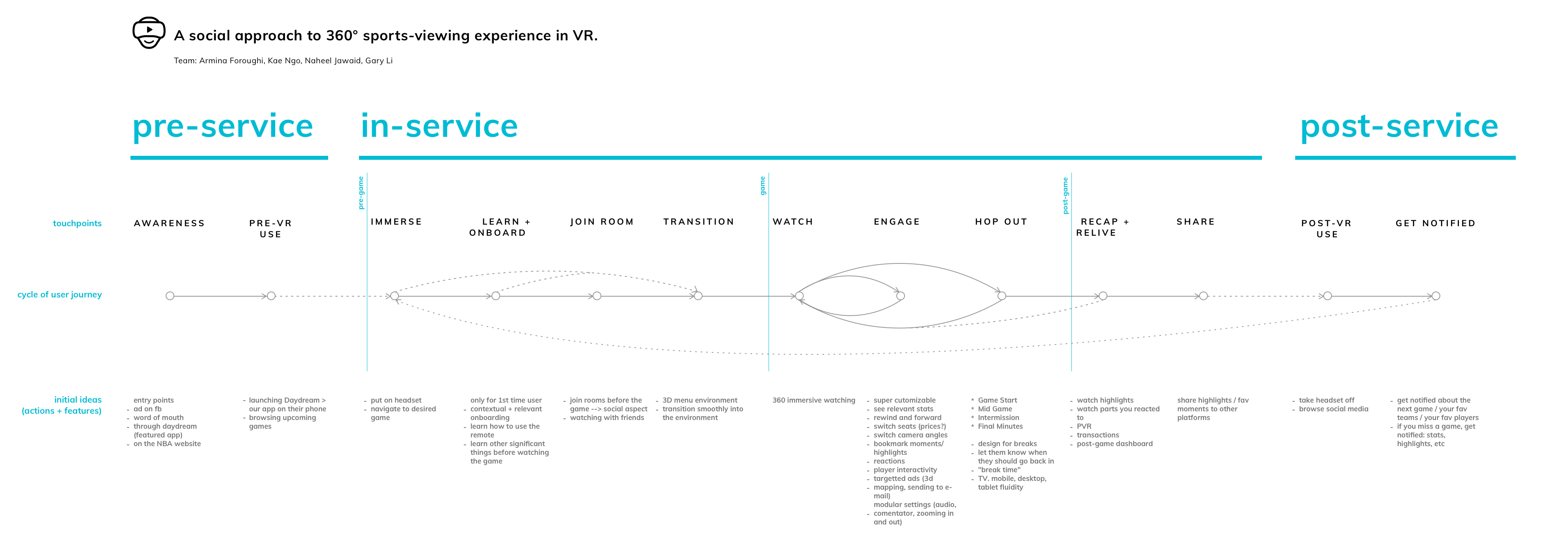
Journey Framework: Watching Basketball
It was important for us to better understand our viewer’s motivations and behaviours, therefore we outlined a full walkthrough of the game watching experience. Using our research and insights, we created a framework that helped us map out significant viewer touchpoints and deliberated on potential areas of intervention. In the end, this framework helped to map out our ideas, and moved us forward with key features for our prototype. Below is a simplified version of our map with all the features listed for each touchpoint that we iterated on.
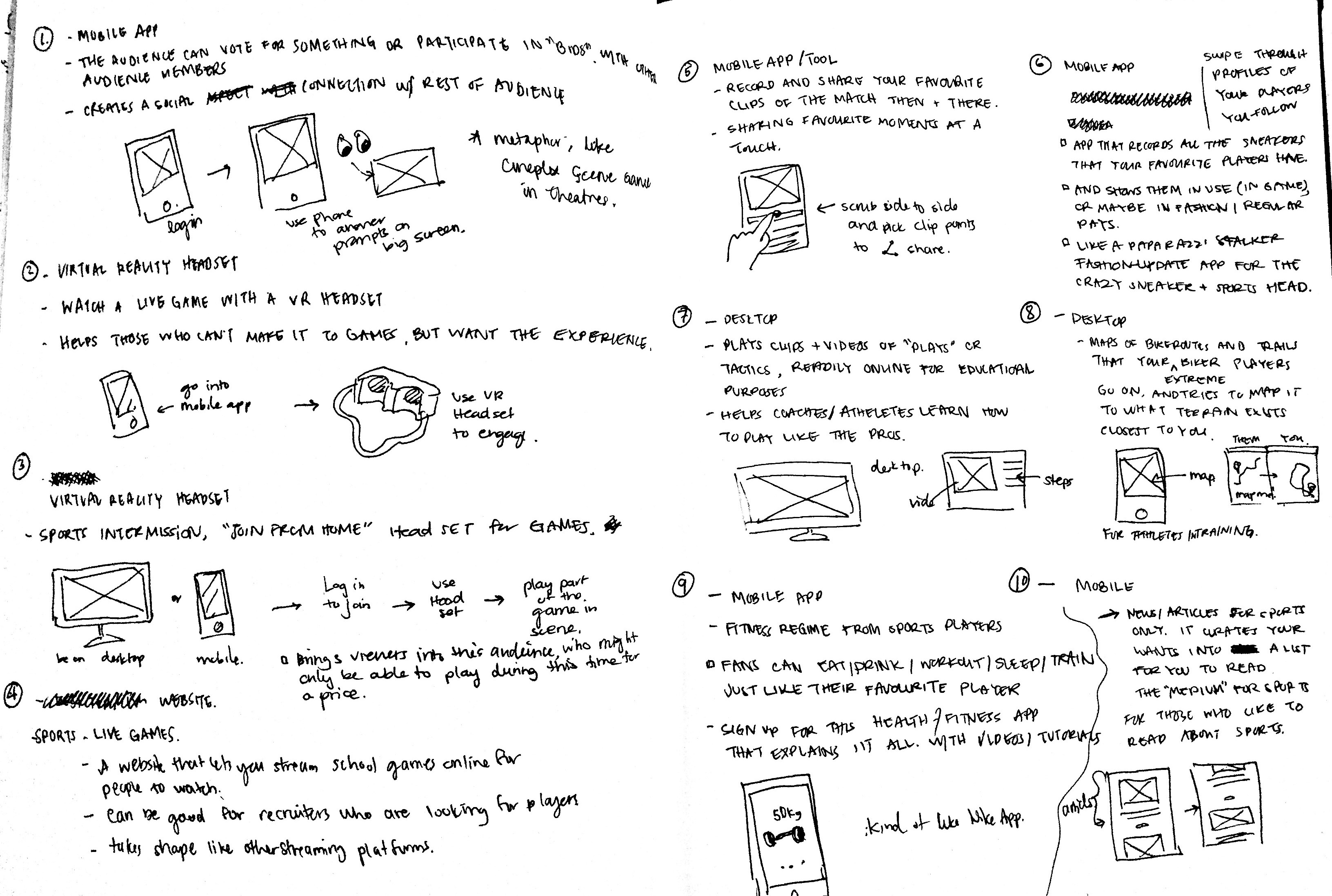
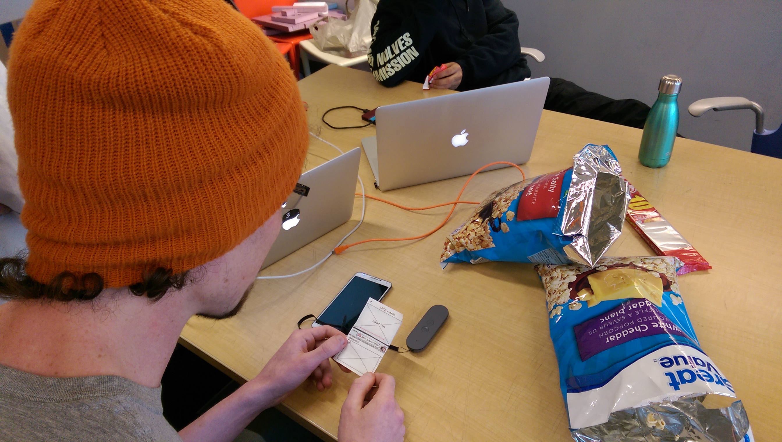
Quick Sketches and Learning Unity
Unlike mobile/web digital designs, there aren’t many quick and easy prototyping tools ready for VR. In the case that we needed to rapidly iterate and visualize ideas to communicate concepts and interactions, Unity didn’t have an efficient enough workflow for us to quickly prototype or iterate on our ideas (especially since we were just learning how to use it). So we went back to sketches and used templates (a resource by Facebook Design) to help define the real estate range for our UI elements. Before getting ahead of ourselves in high fidelity mockups and prototypes, we tested our designs in segments, allowing us to better understand scale and iterate on spatial positioning in the VR environment.


First Iteration Prototype (A)
Unity proved to be a steep learning curve, so to tackle this in such a short amount of time, we split up tutorials and taught them to each other in workshops. To help us prototype we also used other tools like Facebook VR design template, and Google VR SDK. The workflow was challenging but went smoothly, we were able to find hacks and created a default file (360 NBA environment complete with editable Daydream controls) that each team member could work from to speed up the process.
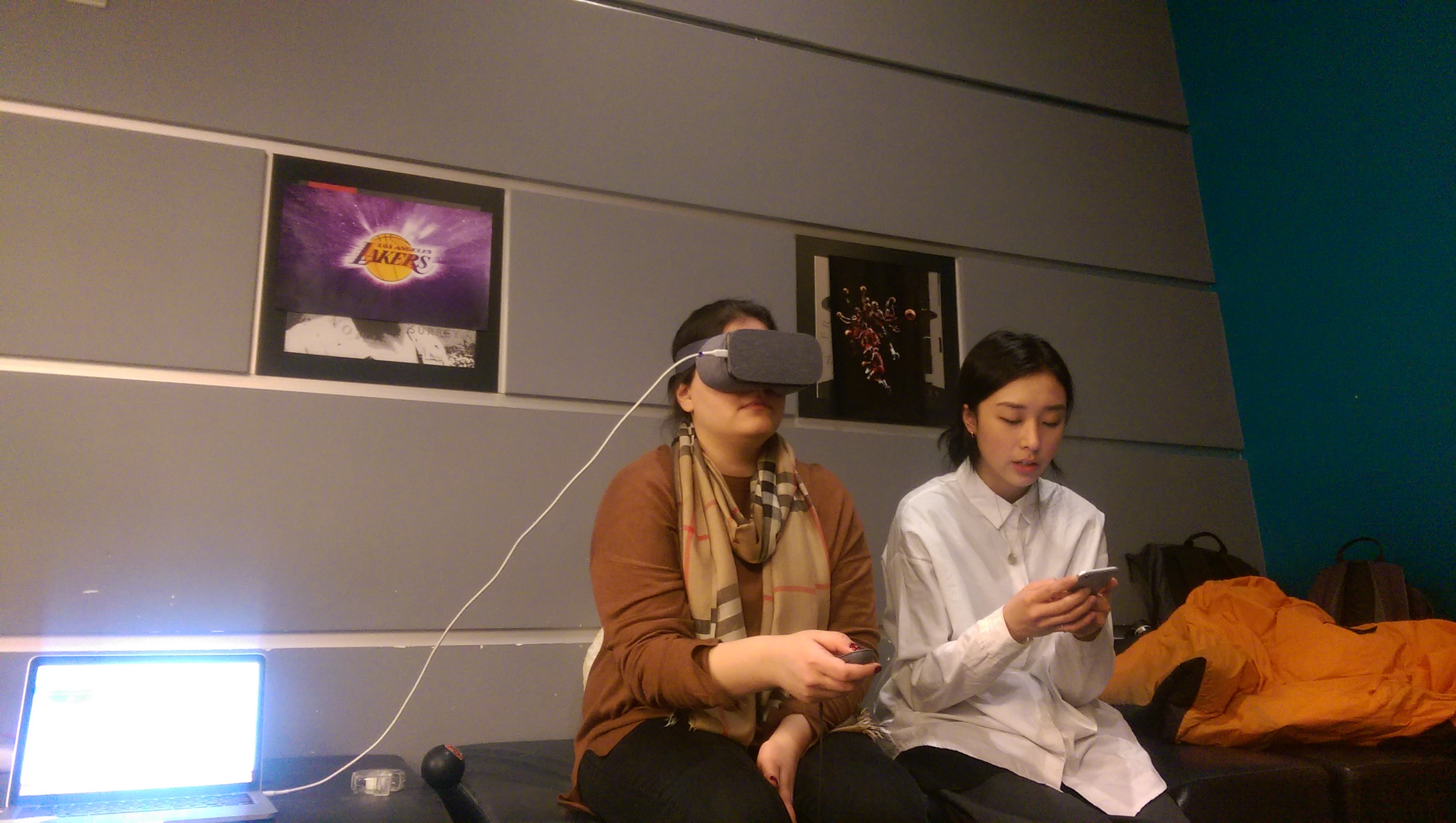
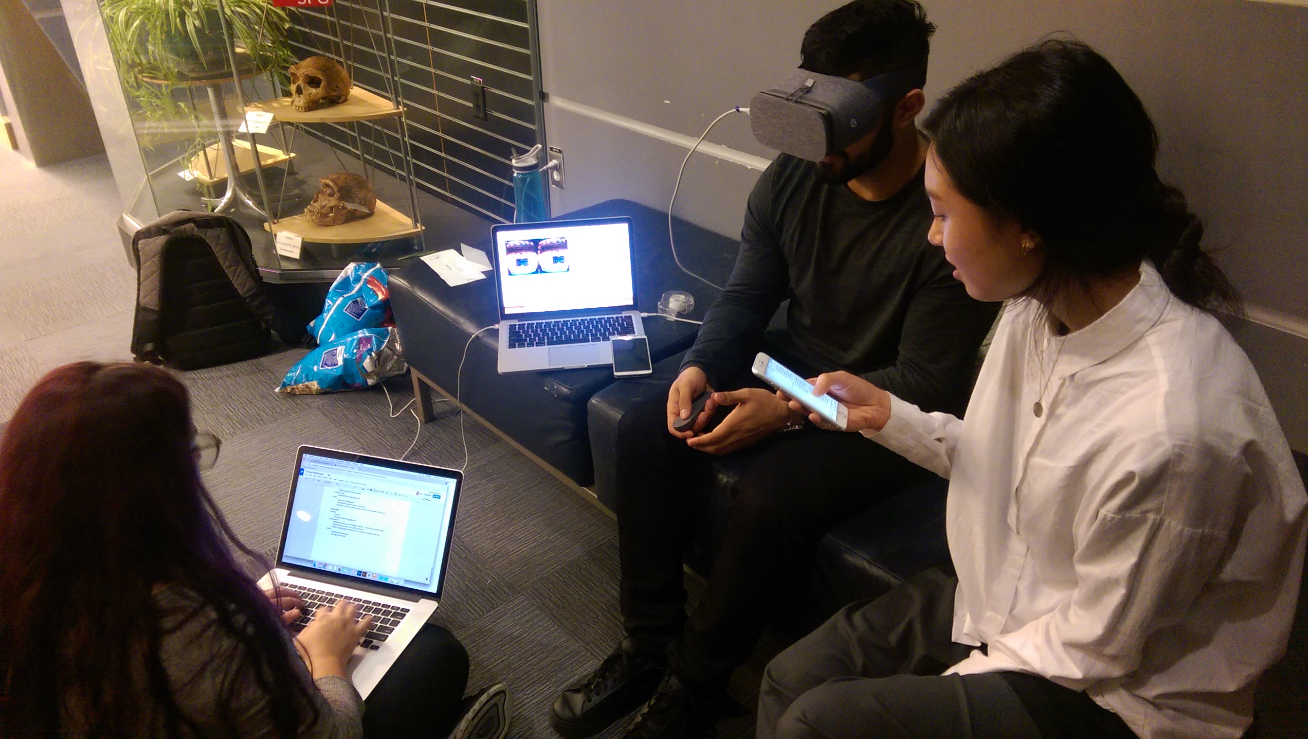
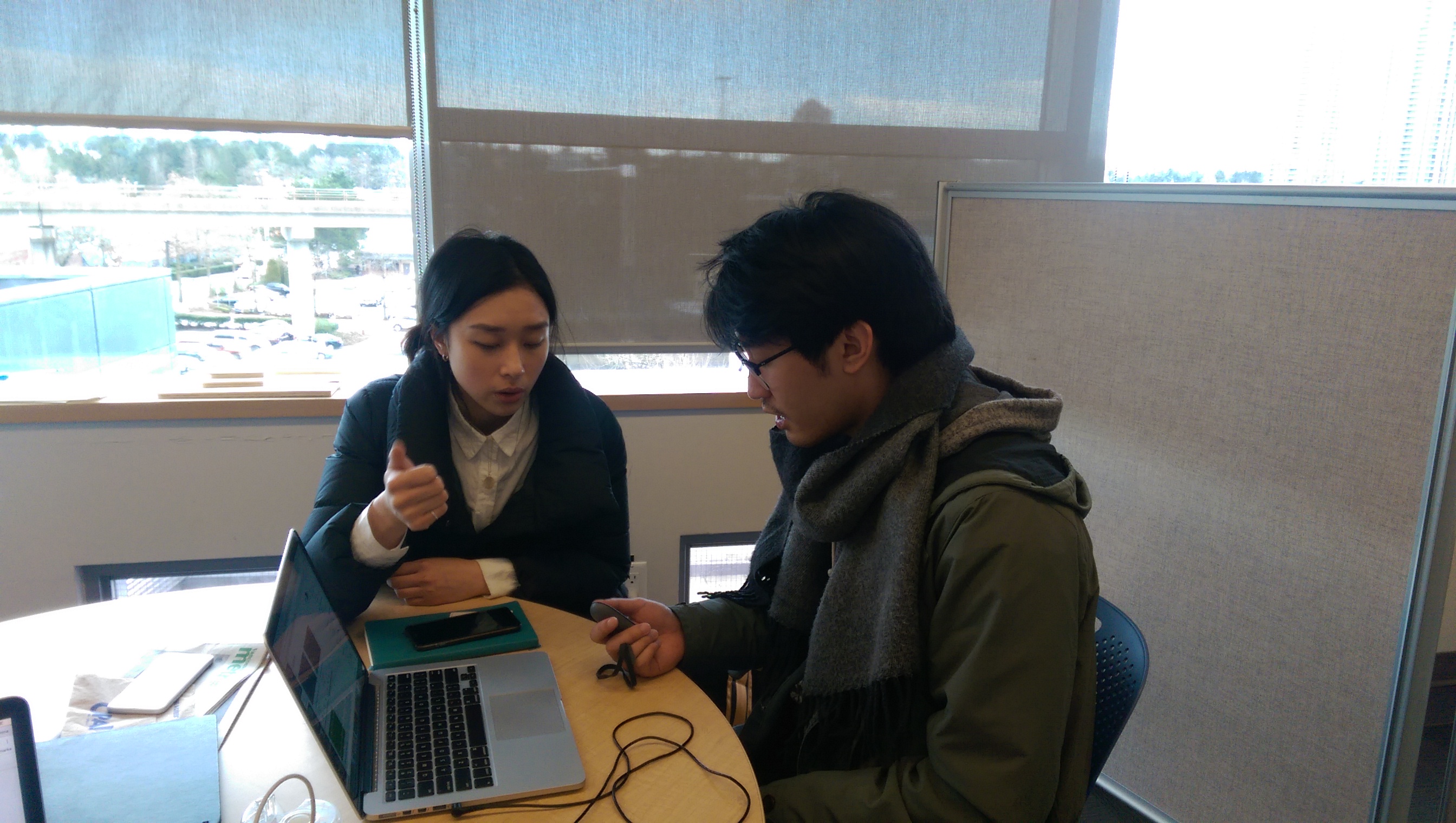
User Testing Prototype (A)
Once we completed the first iteration prototype, we tested with 5 users. Leveraging our journey framework we had our users move through 4 scenarios: finding and selecting a game to watch (evaluating the games and social tab experience), watching the game and interacting with in-game features (testing overall visibility, usability, and comfort of UI elements), taking a break and returning to the game (noting behaviours and responses to mobile app transitions), and lastly ending the game (evaluating the value of the end-game flow).
During our tests we took notes and connected the Google Pixel to a laptop to see what our users were interacting with in order to make appropriate inferences of their behaviour and motivations. Once the insights were synthesized, we improved our product based on our user’s feedback, and made iterations on any other refinements to the system to create our final prototype. Some key areas of improvements were: adjusting UI sizes and depth perception, making hover-states more prominent with sound, re-positioning UI to be more discoverable, and iterating on post-game dashboard features to meet spectator expectations.
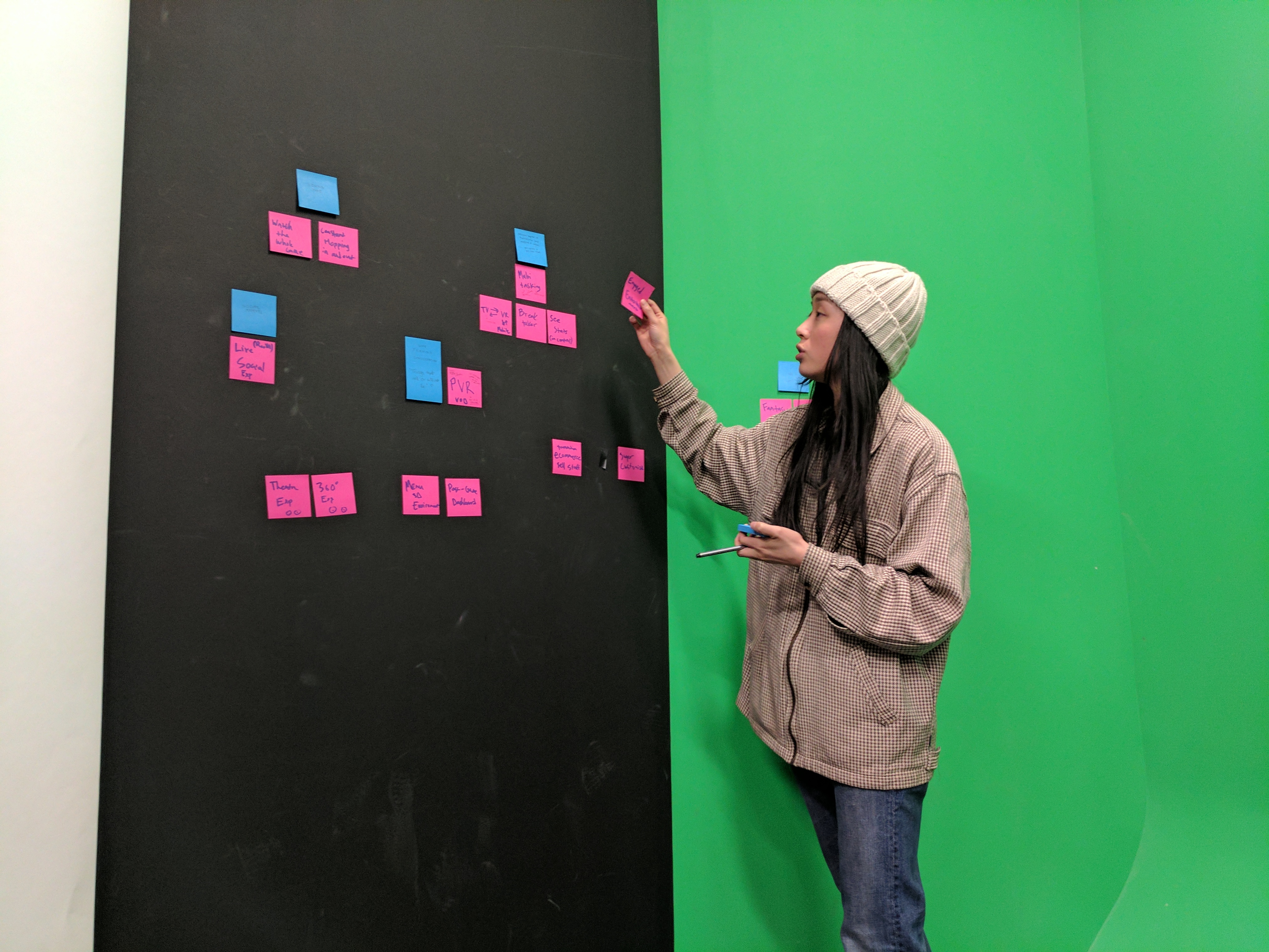
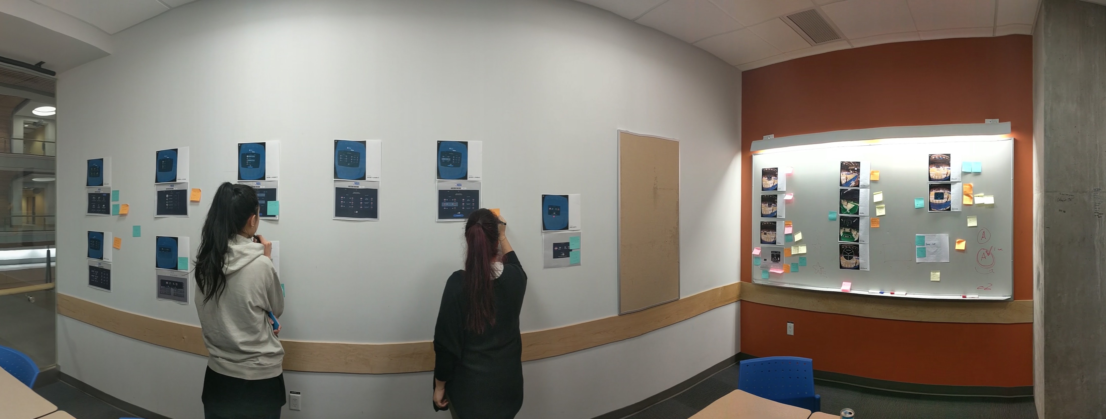
Critique and Re-think
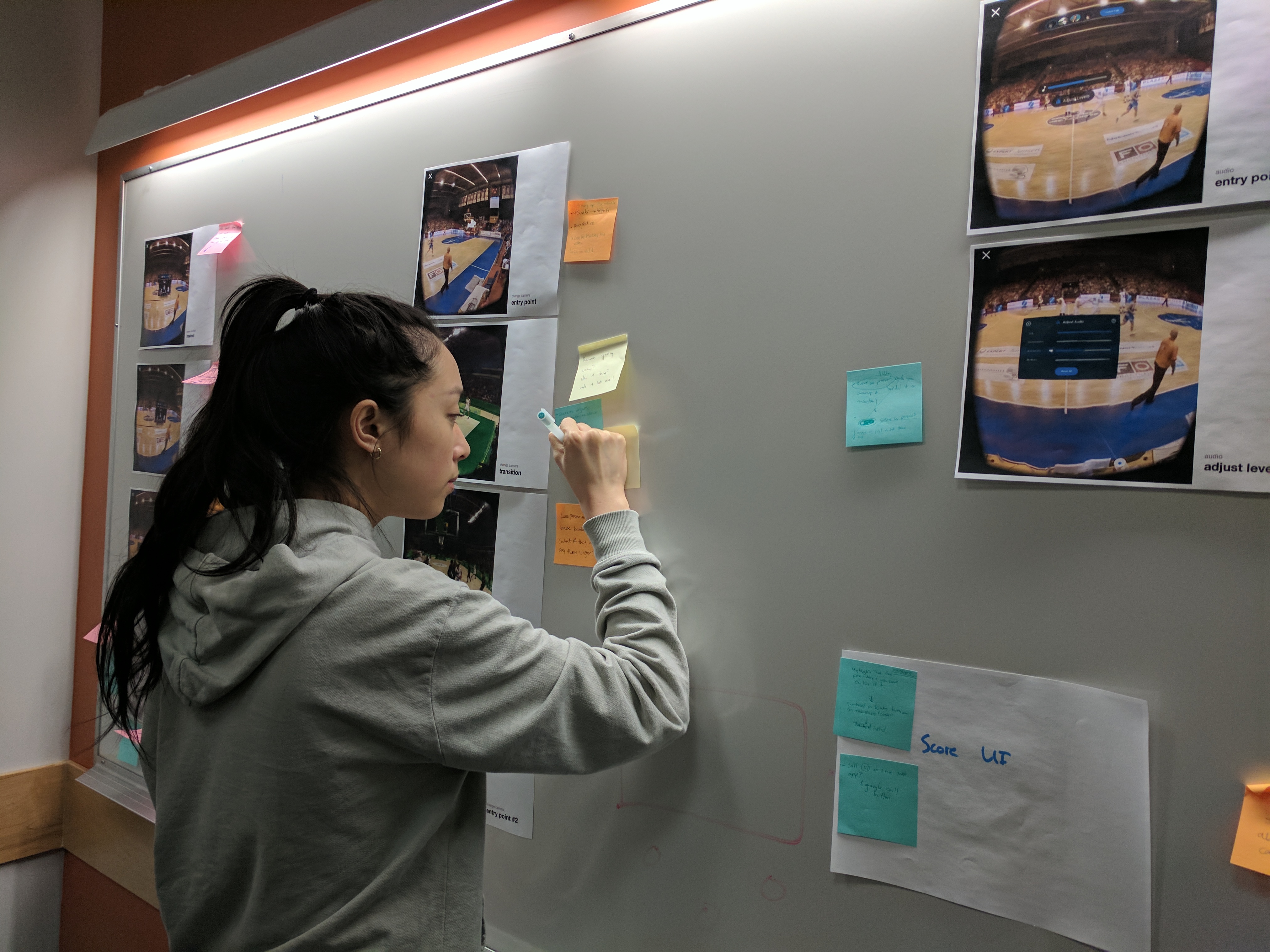
After summarizing our test results we needed to evaluate our VR prototype; our team printed out all the screens and placed them on a wall so that together we could see our designs in context and begin critiquing. With the findings in mind, each of us individually went around and used post-it notes to make any remarks and critiques; we discussed our thoughts and solidified the improvements needed to move forward for our final prototype.
Second Iteration: Prototype (B)
We got the hang of things by the time we started refining our final prototype. Now we were able to focus on other aspects of the project, like working to optimize the files, and creating a video reel of the project (which you can watch here). Lastly, to produce the final high fidelity prototype, we refined our UI and visual designs based on feedback from the user tests, and annotated/spec’d different flows in Sketch for final development.
Previous
Next