Experience Hue
A redesign of Hue Experience to encourage learning through exploration while also making the existing value propositions more explicit.
Role
User Experience
User Interface
Content Strategy
Team
Amy Truong
Assets
Wireframing, Prototyping
Philips Hue is smart lighting that you can control via your smartphone or tablet. Experience Hue is an interactive, immersive experience page that lets new customers explore the different capabilities of what Hue has to offer. By allowing customers to have a chance to play with Hue in different home settings, Experience Hue fills the gap between seeing and believing what light can do.
The redesign focuses on implementing and adapting Hue app design practices to the mobile-web experience. The goal is to improve the way we help guide the user to learn about Hue through simple interactions where they can explore and experience it for themselves. During this project, my role included auditing the existing site and competitors, sketching and wireframing, user interface and visual design, and prototyping.
Proposal
Experience through exploration
The proposed redesign has a landing page with blurbs and descriptions of each room so new customers can understand a little more about what they will be learning. The room page separates the icons and introduces tabs for more controlled browsing, with the cards and content aligning to the focus of each room.
Content is Queen
Redefine, reorganize and renew
Looking at the cards, we found many of the links out went to product detail pages, and the value of the Hue system was hidden in irrelevant groups of iconography. We felt that a lot of expectations were set through the copy that were then never met, which was a frustrating experience. In this version, we found a clear need to improve the content.
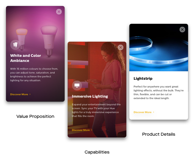
Card Types
Value, Capability, and Products
In reorganizing the content, we decided to take a different approach to the current information architecture, where the existing content is grouped into three categories, shuffled, and delivered in cards. Each card type is subtly differentiated through imagery; concept, lifestyle, product image. In addition, some new content was created as necessary to keep a good balance of product values between each room.
Values and Controls
Focused Hue Experiences
In doing so, we also gave each room a different Hue control and focus so each room would more clearly present the value propositions offered by the Hue system; both in how that differentiates Philips from other competitors, as well as how the customer can benefit from use.
See Information Architecture Map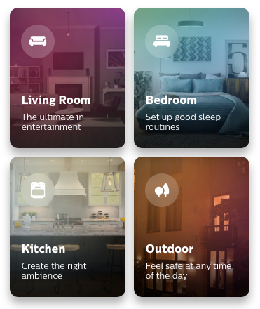
Navigation
Seamless exploration
By working with tabs and icons, there are more moments of delight in the exploration. Content is gradually revealed, cementing a pace to the learning. The ability to switch between all the rooms at any point versus the limited access of the current version also opens up more possibilities for exploration.
Challenging Constraints
Maintaining delightful experiences
Aside from tweaking the design and content to better enhance the user experience, the other great challenge was aligning the experience with the Hue app. If the customer was attracted to the possibilities shown, they would likely expect the same experience and once they owned the product; consistency with design elements helps ensure that as well as a seamless transition of learning.
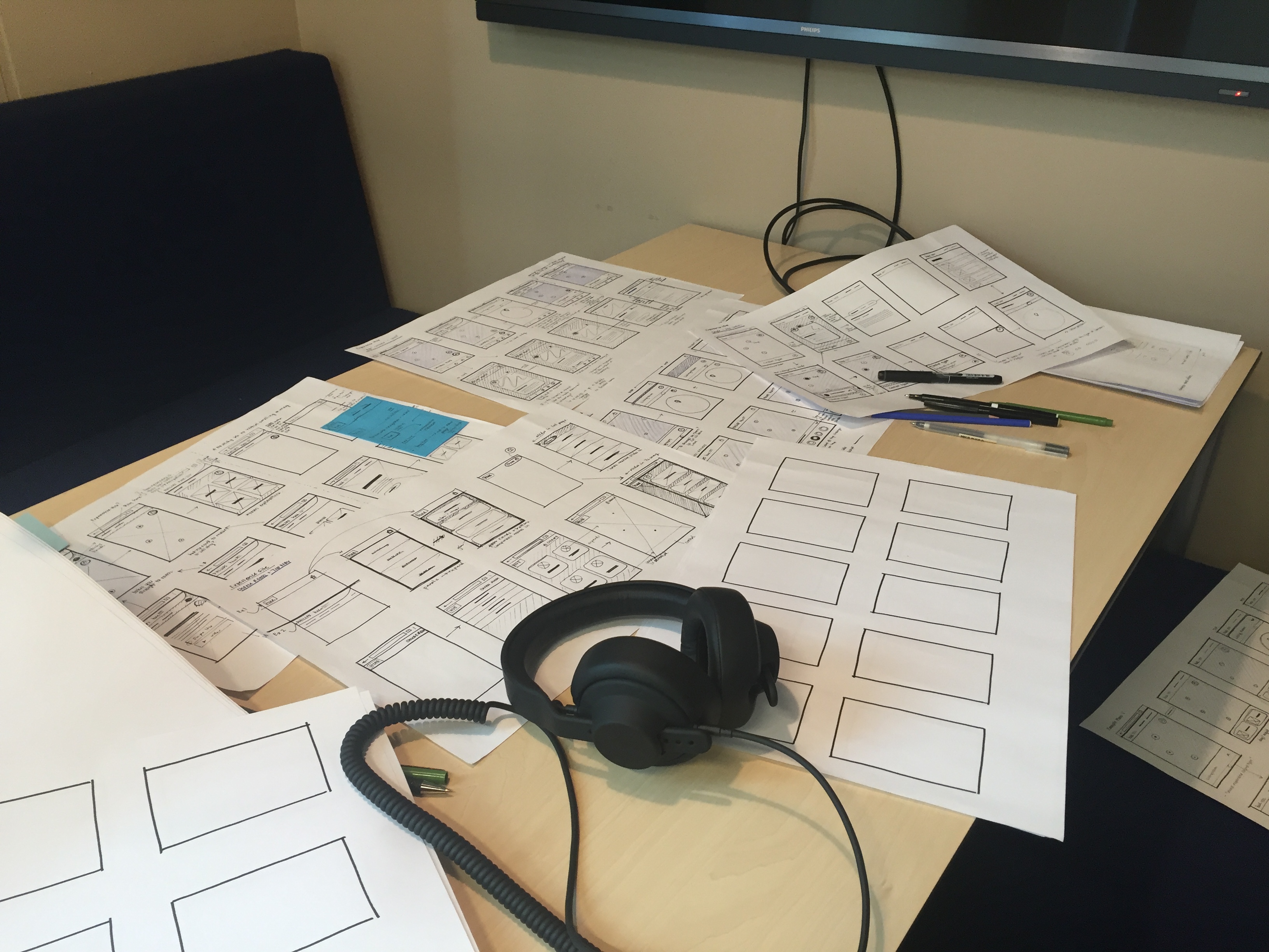
Web Version
Sketches and Iterations
Check out a deck of my process here
A special thanks to the HUX Team.
Read more about my internship experience on Medium @kae.linh
Previous
Next