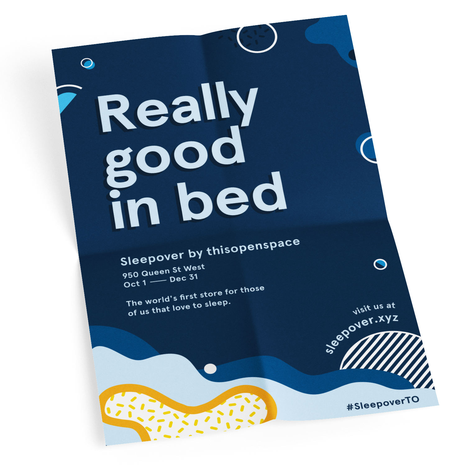
Sleepover
Creating a visual identity for The Store, thisopenspace’s first flagship retail launch in Toronto.
Role
Visual Design
Branding
Print
Mentor
Yvonne Ren
Assets
Storefront vinyls, in-store print material, campaign posters and press cards, social and website media
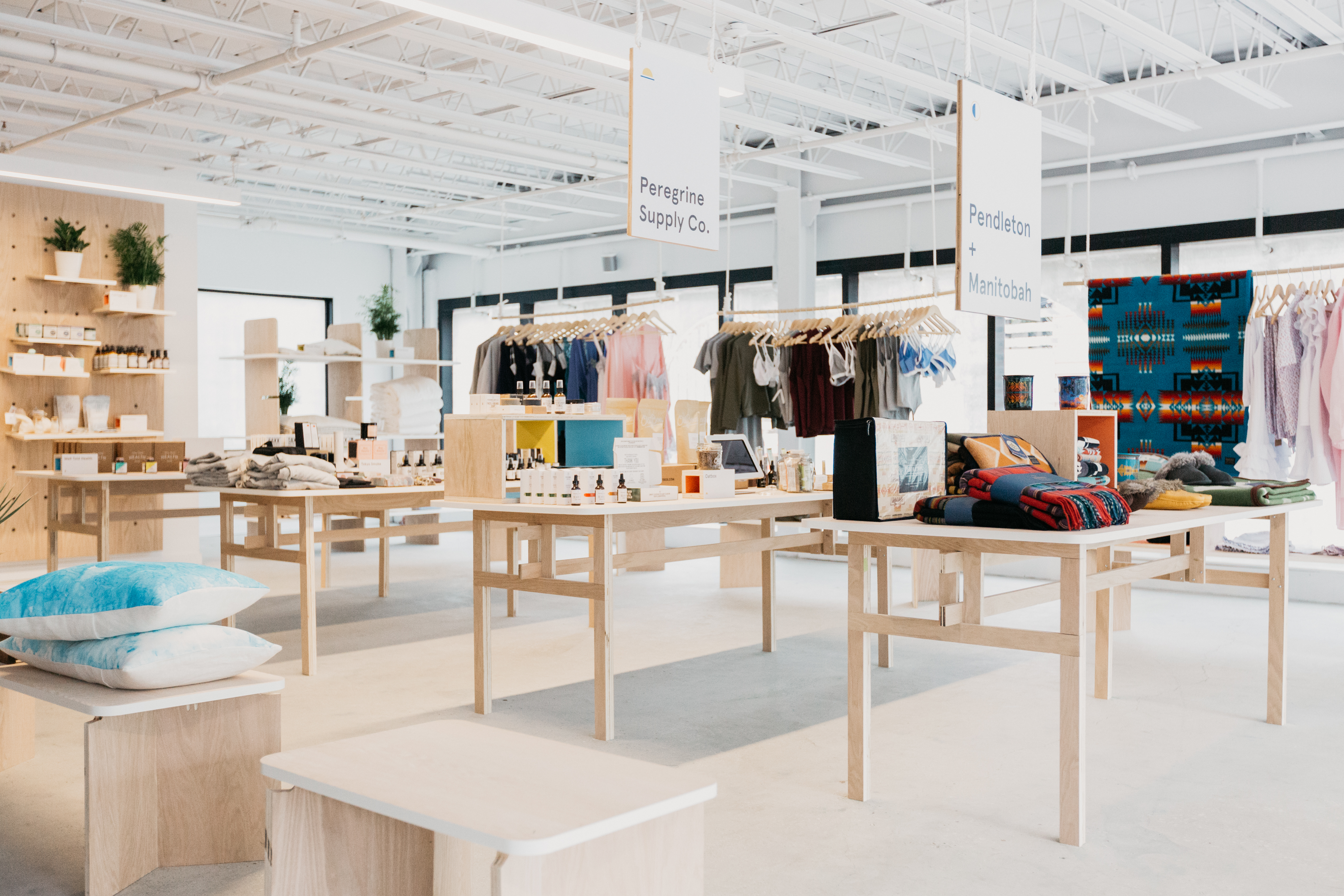
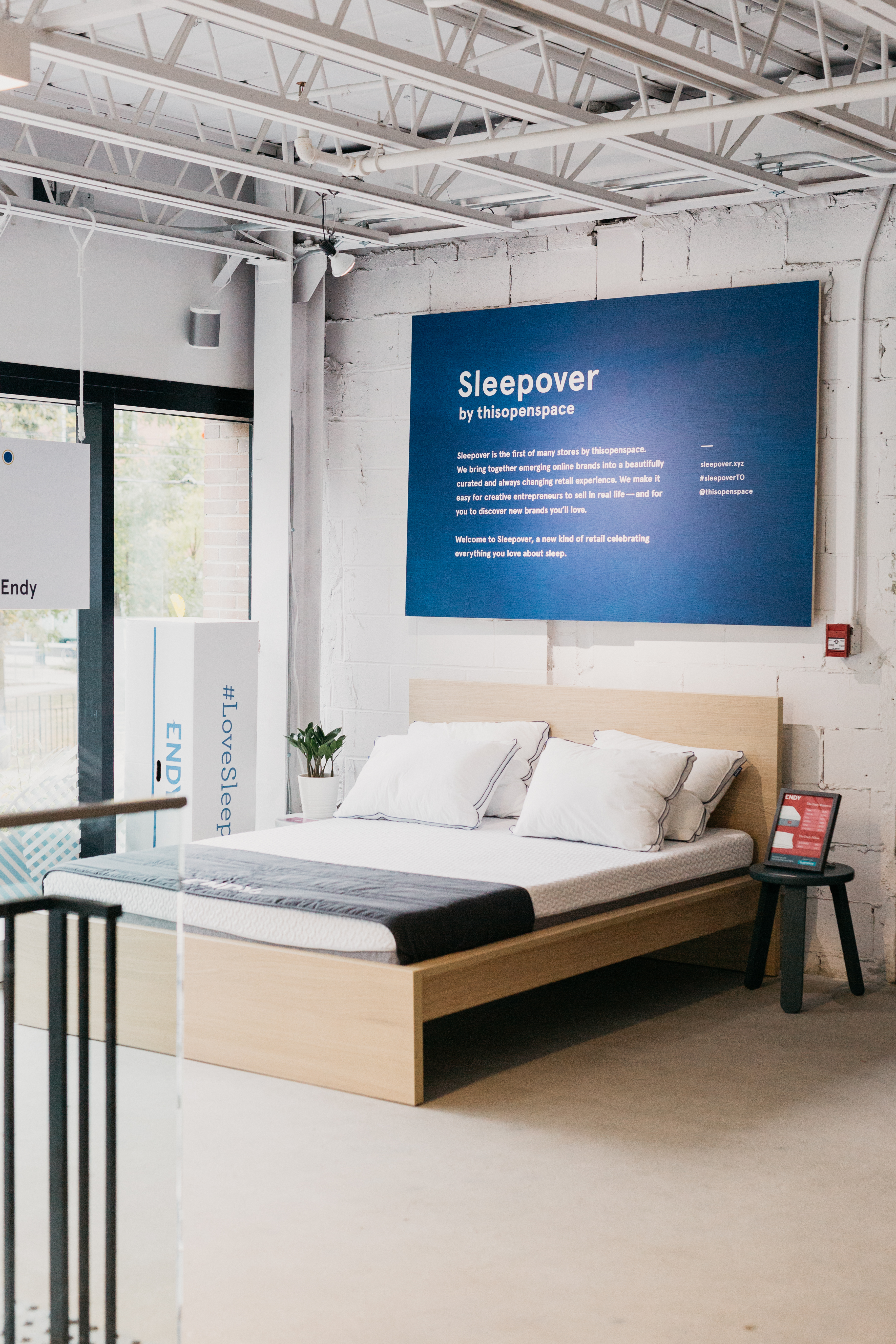
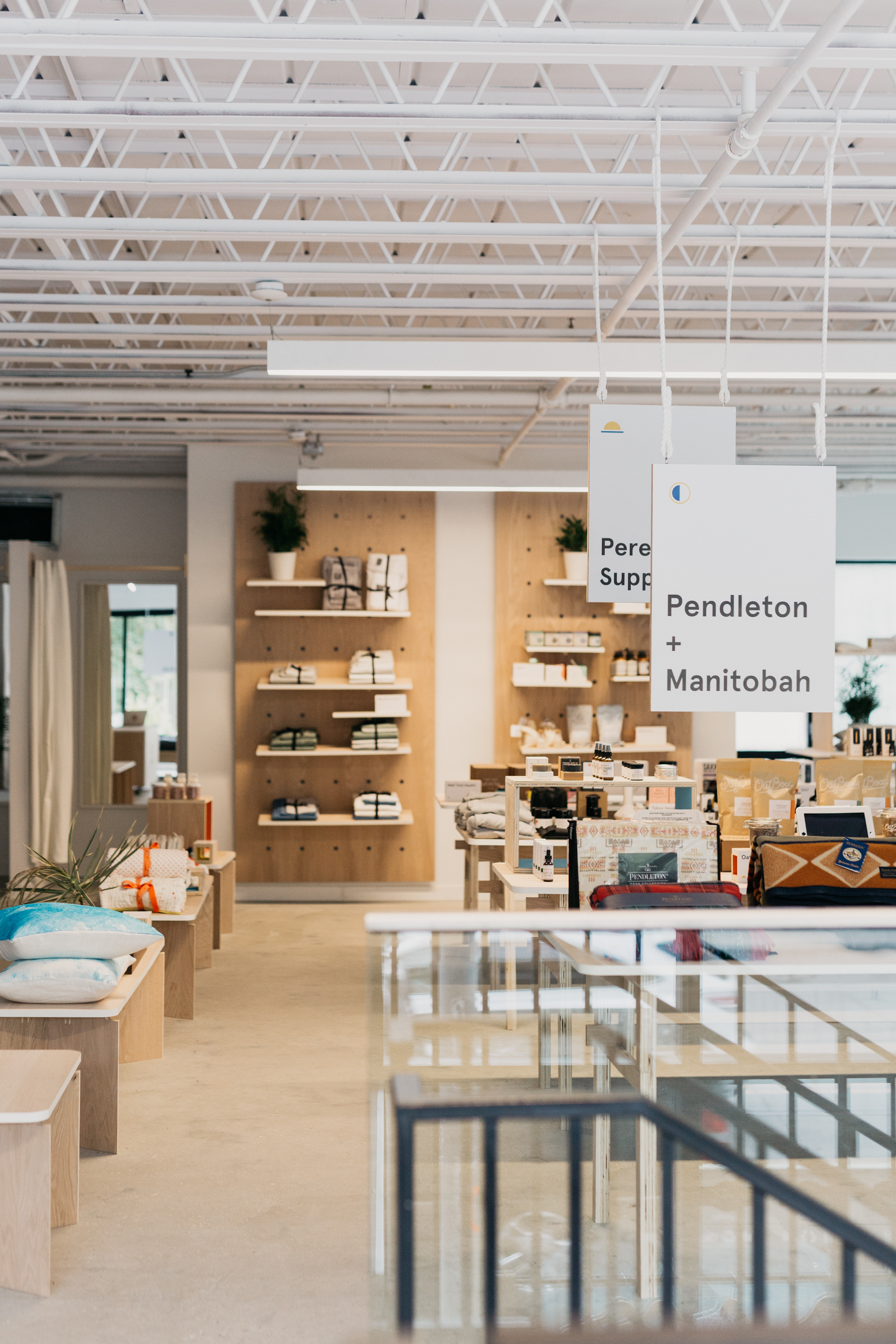
Stores by thisopenspace gives brands access to full-service retail spaces in premium locations, where they can sell in real life and grow their brand. The first store in Toronto, called Sleepover, brings together more than 35 brands celebrating the ritual of sleep. Shoppers can discover a variety of direct-to-consumer brands—a curated place of discovery for everyone who loves to sleep.
During my time as a Design Intern at thisopenspace I was given the opportunity to work on this project from inception to completion, while managing a handful of other visual design and UI projects (see here). As the company’s first physical store project, a lot of self-directing and learning was involved in order to ensure a timely, successful opening. In the end, a bold, light hearted, and abstract visual theme was created for The Store's Sleepover pop-up.
Think Tank
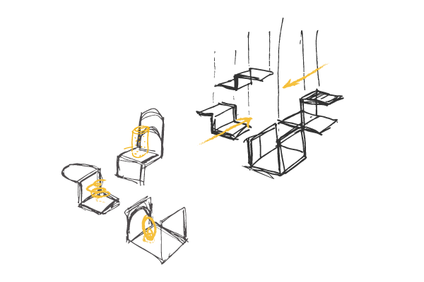
Ideating and Sketching
To kick off this project, the design and marketing team discussed the vision and voice for the store; here we got a better understanding for the kind of brands and products that were to be sold. In additon, some ideas and words that stuck around include: lighthearted, bold, dash of humour, constellations, and early riser. From there, I began exploring my thoughts through sketching, this helped to visualise my ideas and get feedback on them for future iterations.

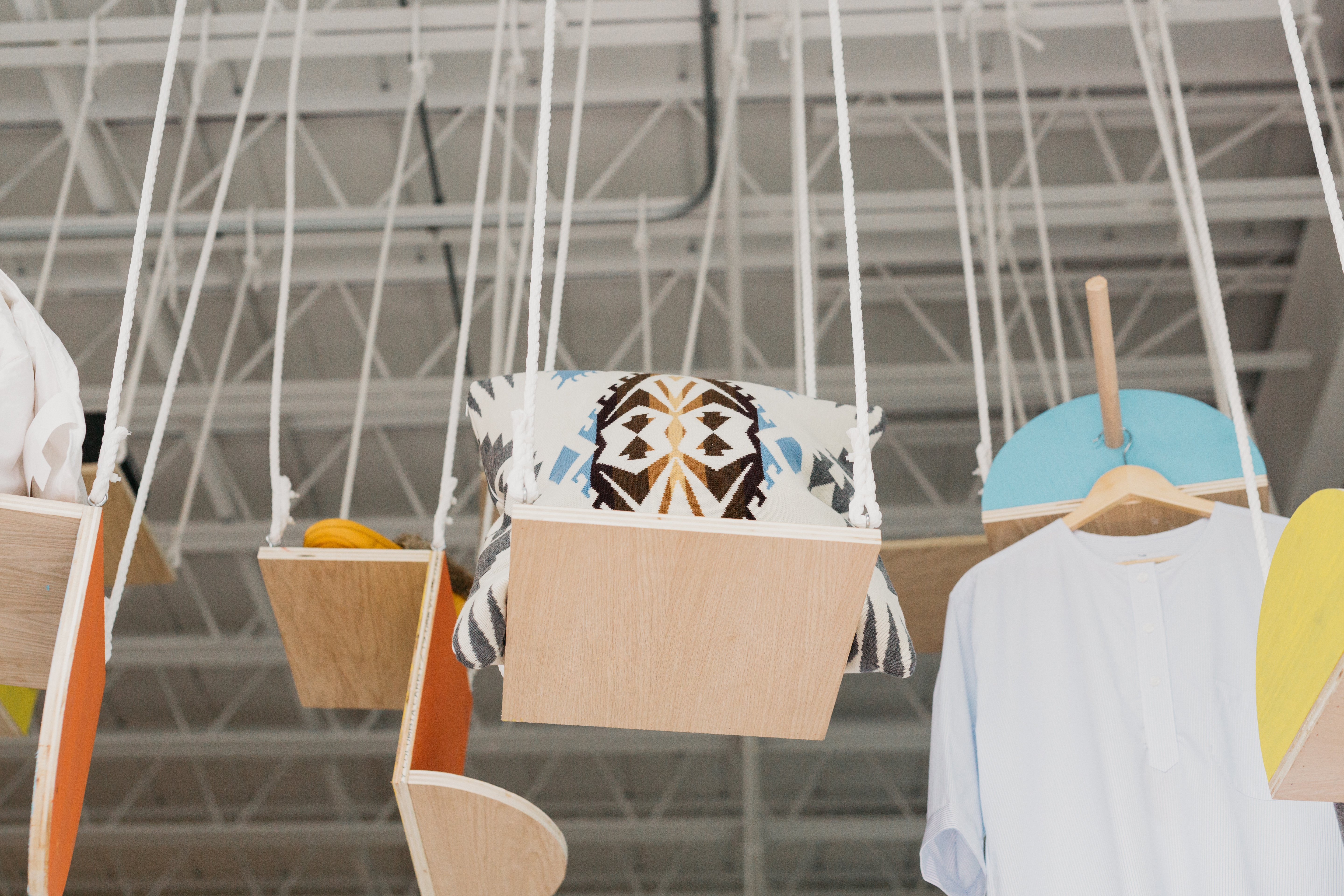
Exploring Elements
Bringing Concepts to Life
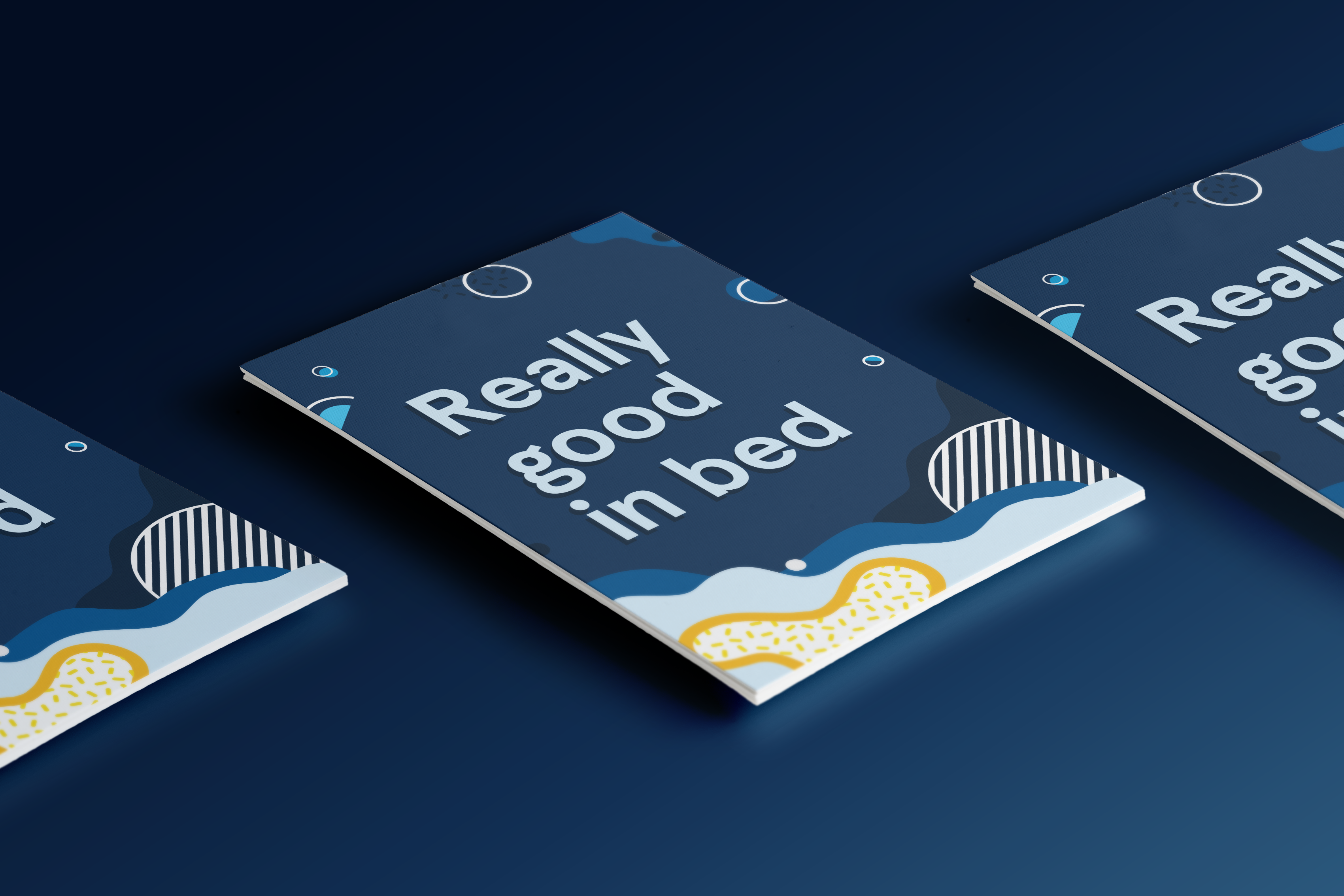
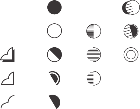
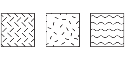
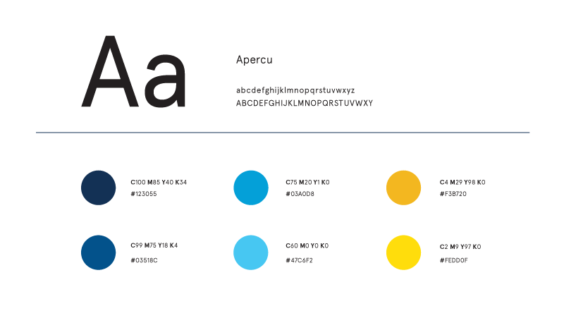
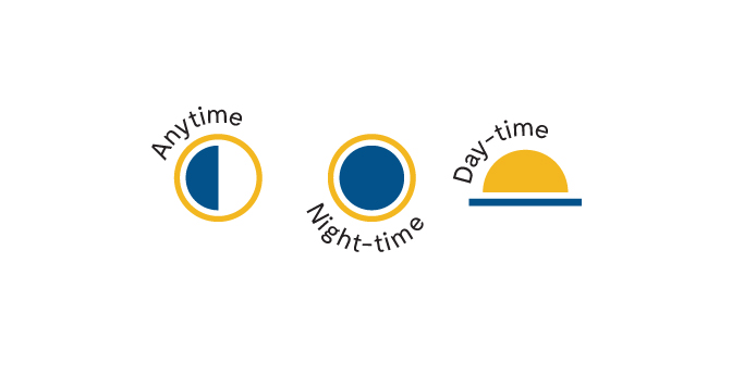
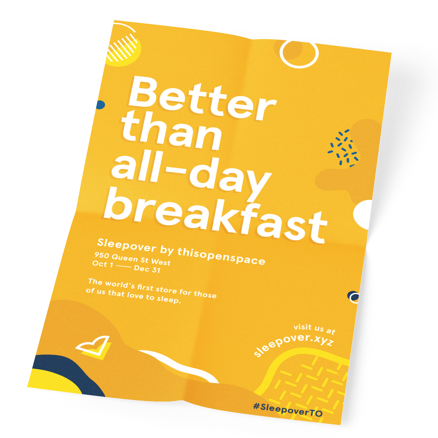
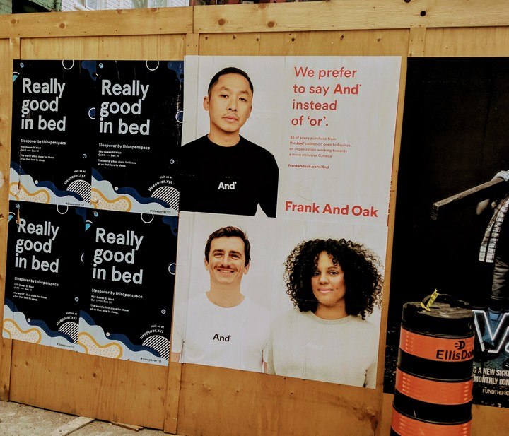
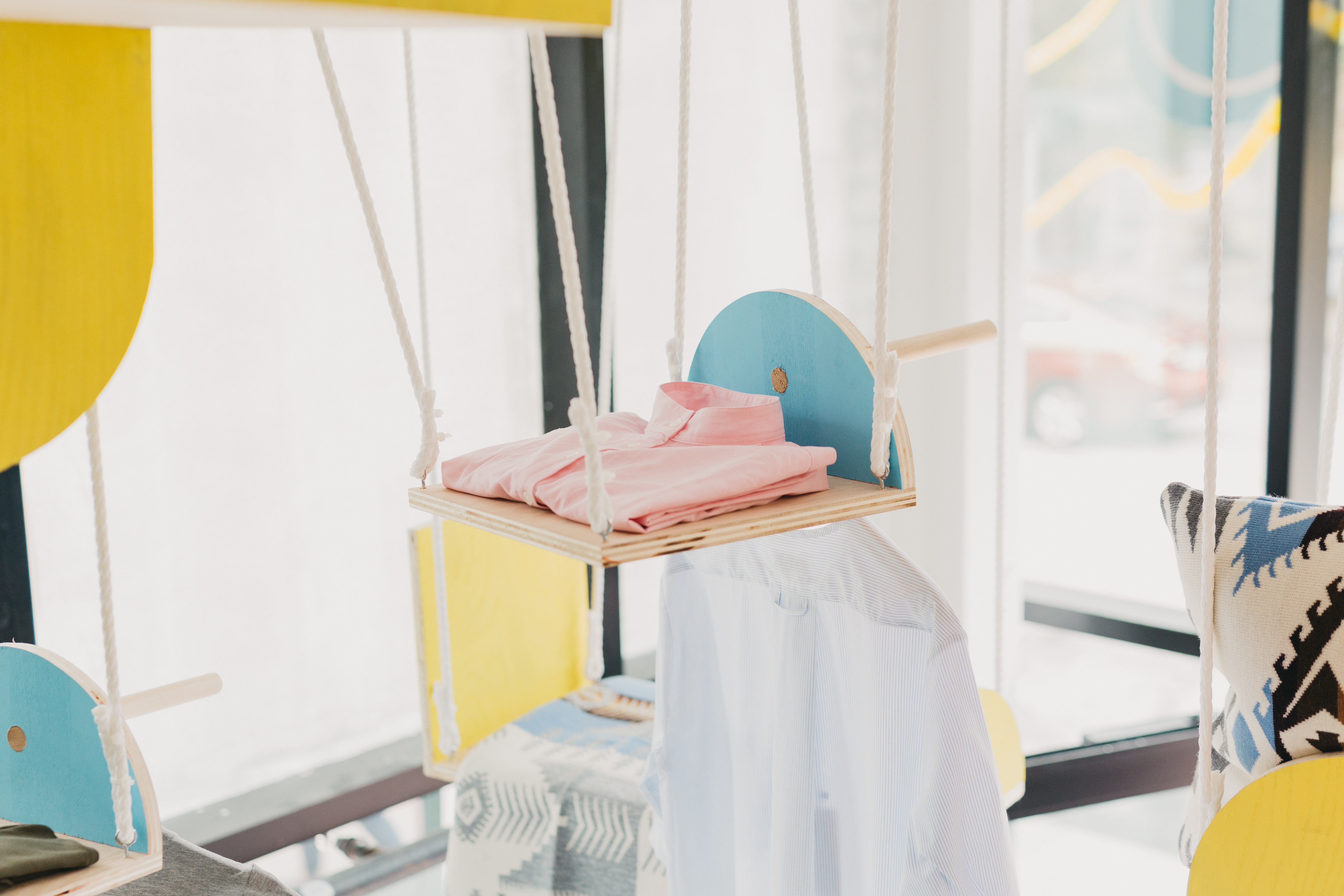
Contrast played a huge part in the brand’s identity, this idea eventually led to a night and day colour scheme, using navy-blues and mustard-yellows. With this direction in mind, I was able to solidify some visual concepts and stuck to clean, finished edges, and played on the idea of contrast in both visual forms and colours (inspired by modern Memphis design). In the end I defined a visual language made up of playful patterns, shapes, and solids—building elements that can work together to create abstract compositions that communicate notions of night and day.


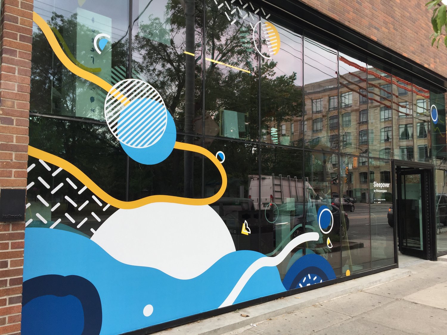
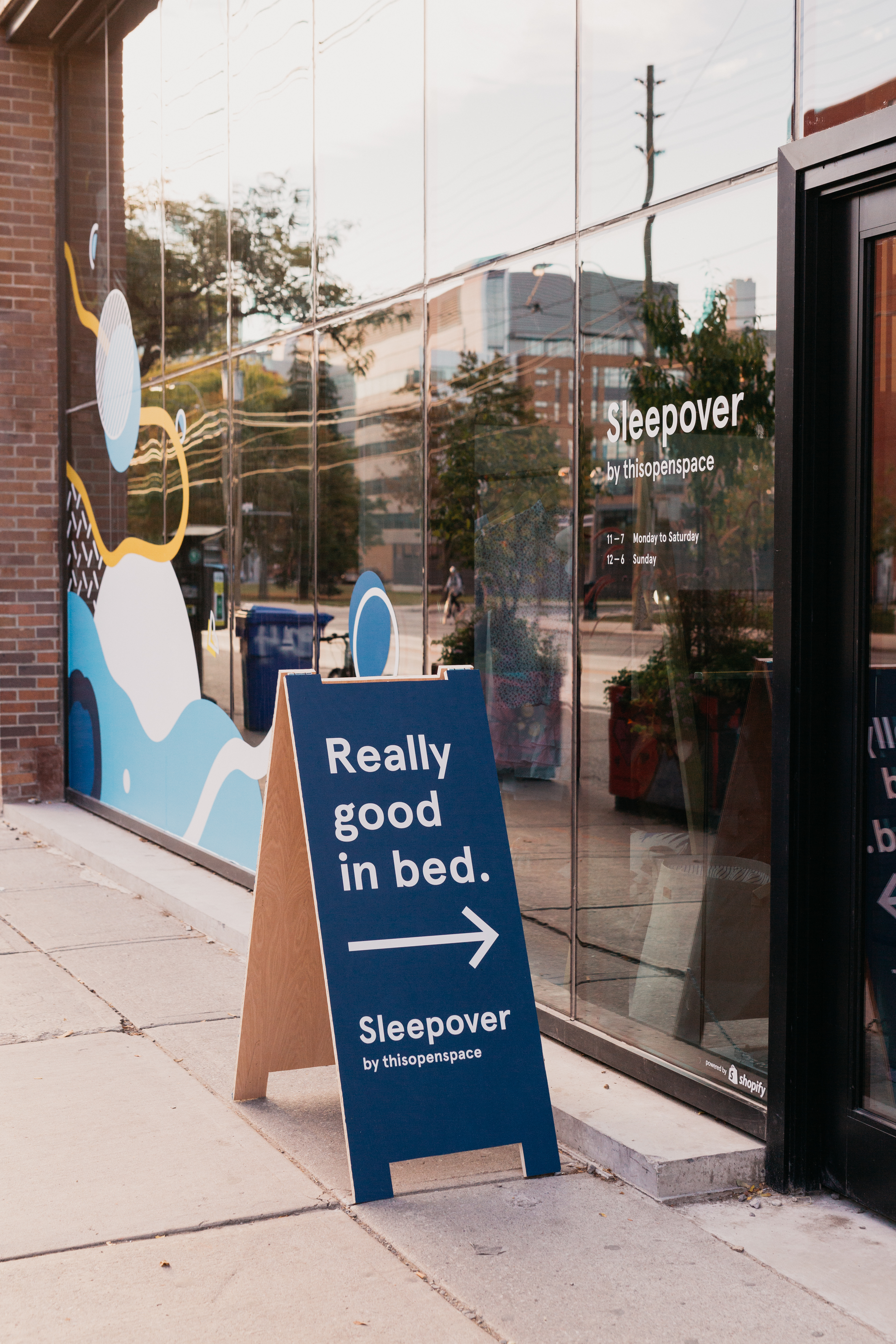
Storefront Vinyls
Details and Management
I also designed the storefront window display. Attention to both visual and technical details were important during this part of the project, since the visuals were going to be scaled up, any inconsistencies would not be left unnoticed. Another consideration was in defining the visual real-estate to ensure enough natural light is visible. To ensure a timely grand opening, I managed hand-offs for deliverables, communicating with vendors for sizing specifications, and specifying directions and requirements with on-location installers for a smooth set up.


Other Visual Work
I was also responsible for the majority of any other visual design work related to The Store, which include:
— Print material on display for brands in-store (i.e. name cards/posters)
— VIP Invitations and Info Postcards
— Social media posts (i.e. Instagram, Facebook, Twitter)
— Blog posts and Emailers
Special thanks to my Design mentor, Yvonne Ren for supporting me along this amazing visual design journey (you rock!)